Role
Sr. Product Designer
Team
14 people
Timeline
Feb – Jul, 2023
Introduction
Planes Live was a flight tracking app tailored to and mostly used by plane spotters — aviation enthusiasts who observe, photograph and document planes. However, analytics and in‑app surveys revealed that our 'power users' were actually travelers. Moreover, this much smaller user group generated a major portion of the app's revenue.
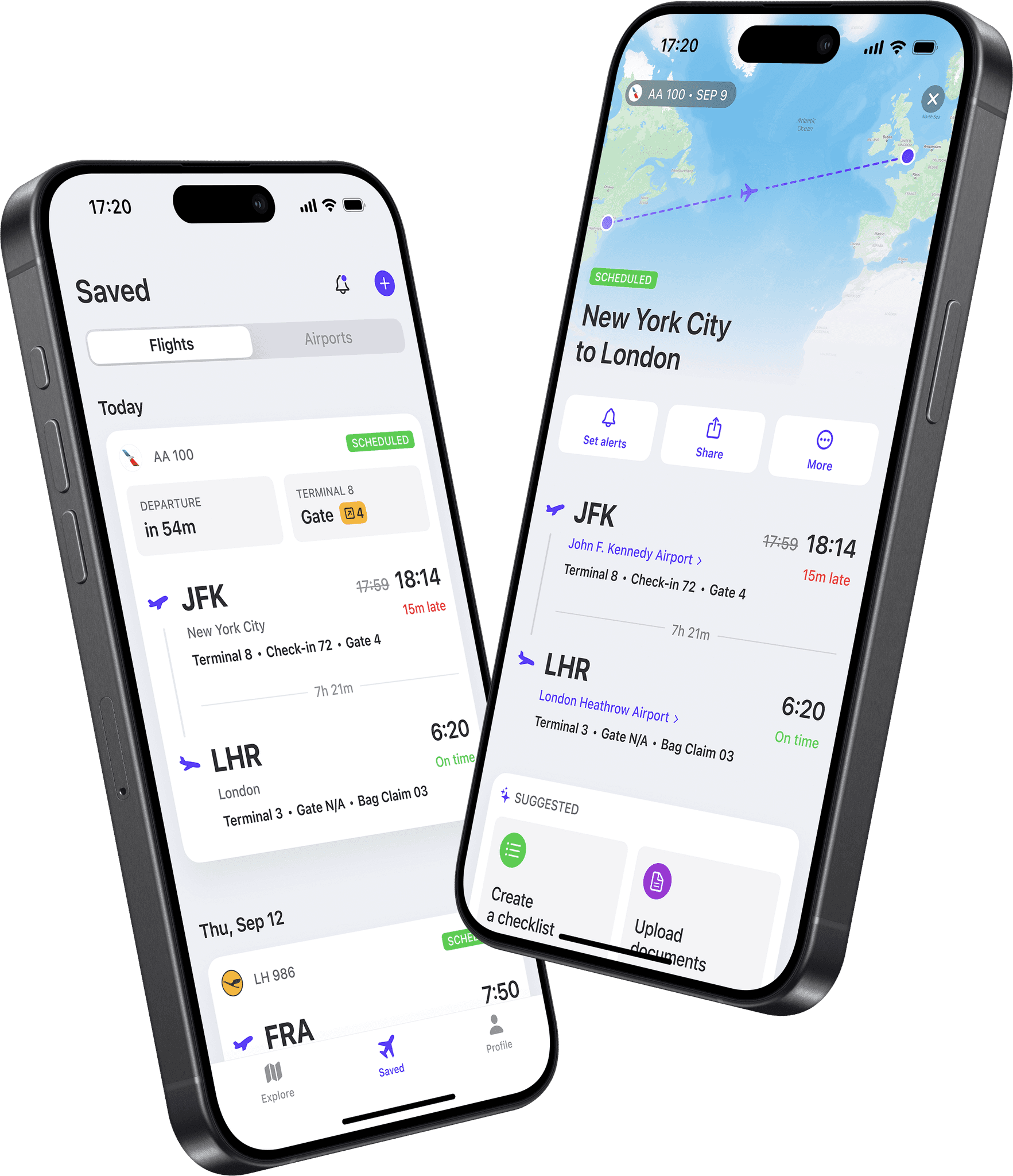
I was in charge of redesigning main travelers' touchpoints — saved flight card, app navigation and flight details page.
Challenges
Flight Card
Travel might be a stressful experience. Imagine you're at the airport, waiting for your flight, everything goes well. Suddenly, the departure gate changes. Now you're running late, baggage in one hand, your phone in the other.
You open an app, desperately search for a new gate number, and see this...
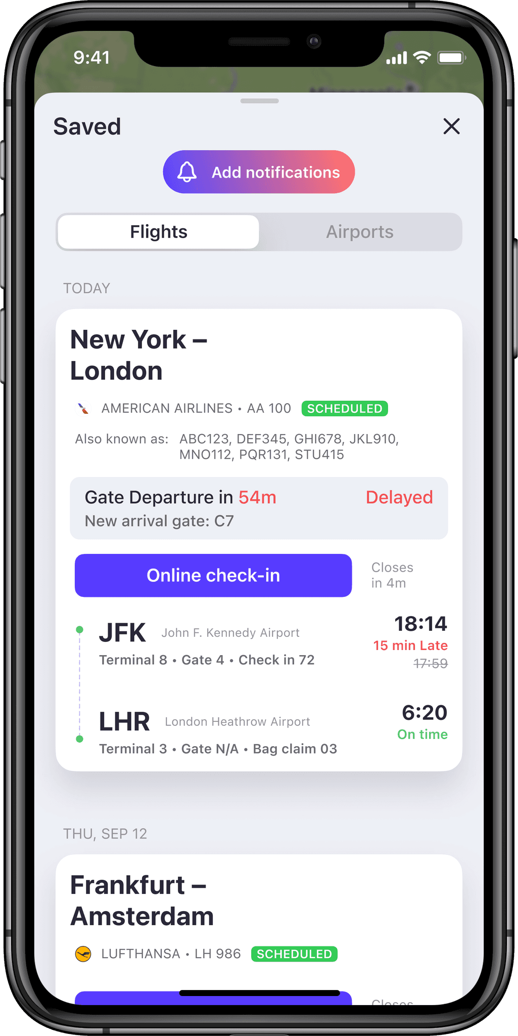
These flight cards won't cut it.
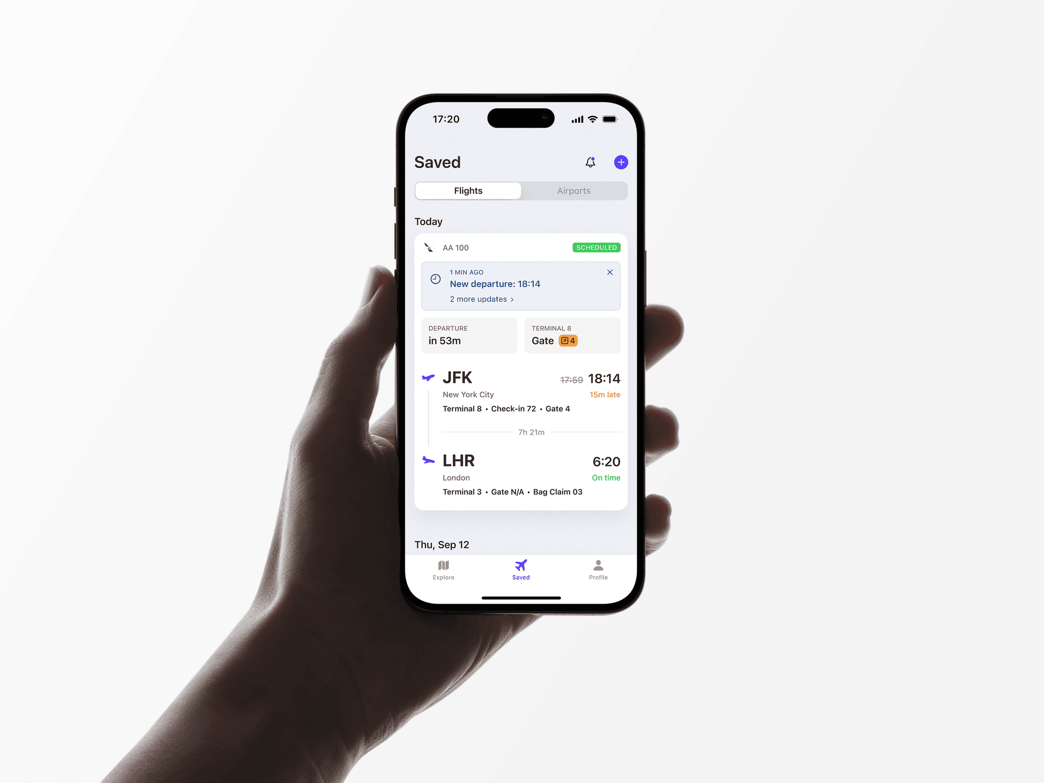
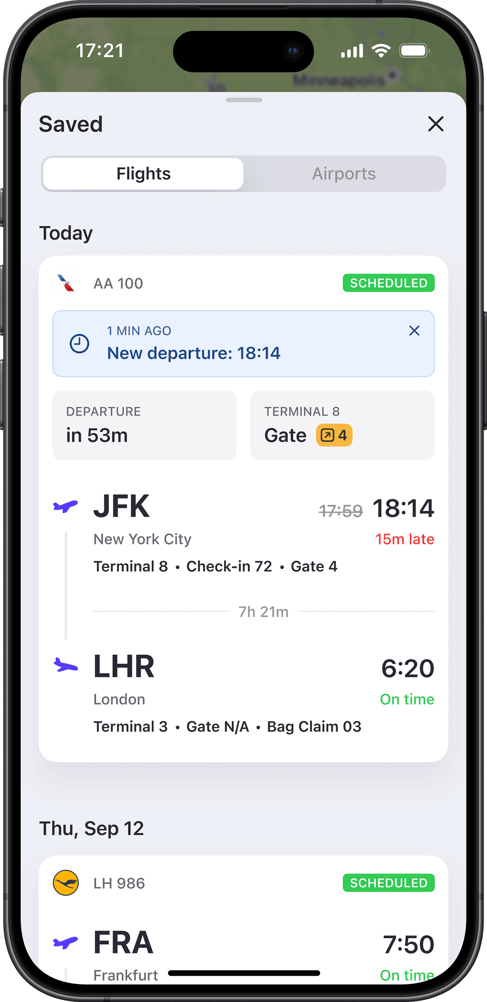
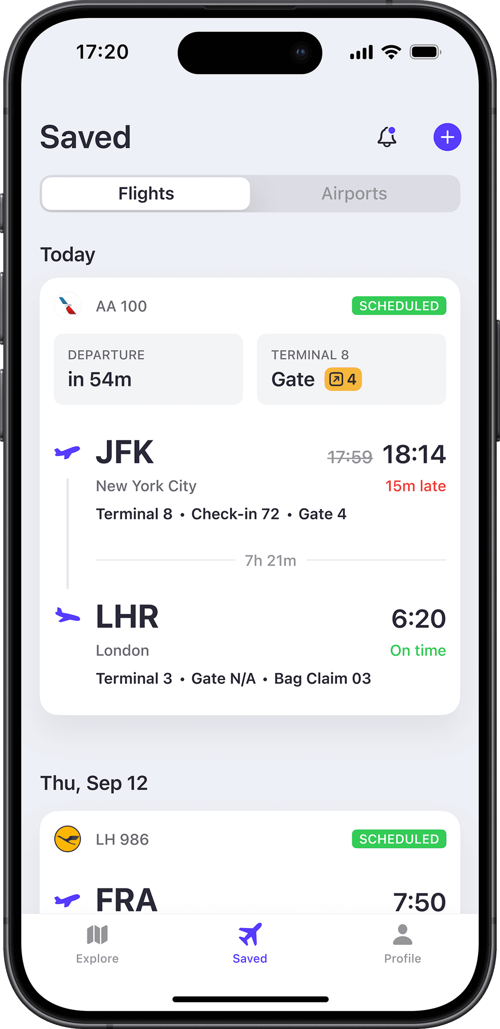
What you need is a quick and up‑to‑date overview of your flight. Moreover, while there's data you constantly need (flight number, departure time, etc.), some data is needed only during specific sections of your travel.
The card will also help you to stay on top of your journey, informing you about important updates: gate changes, delays or cancellations.
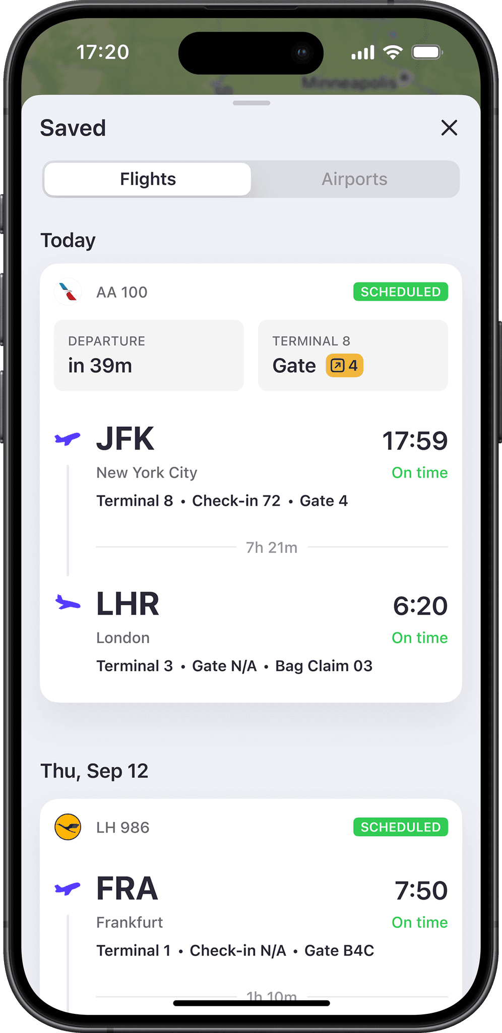
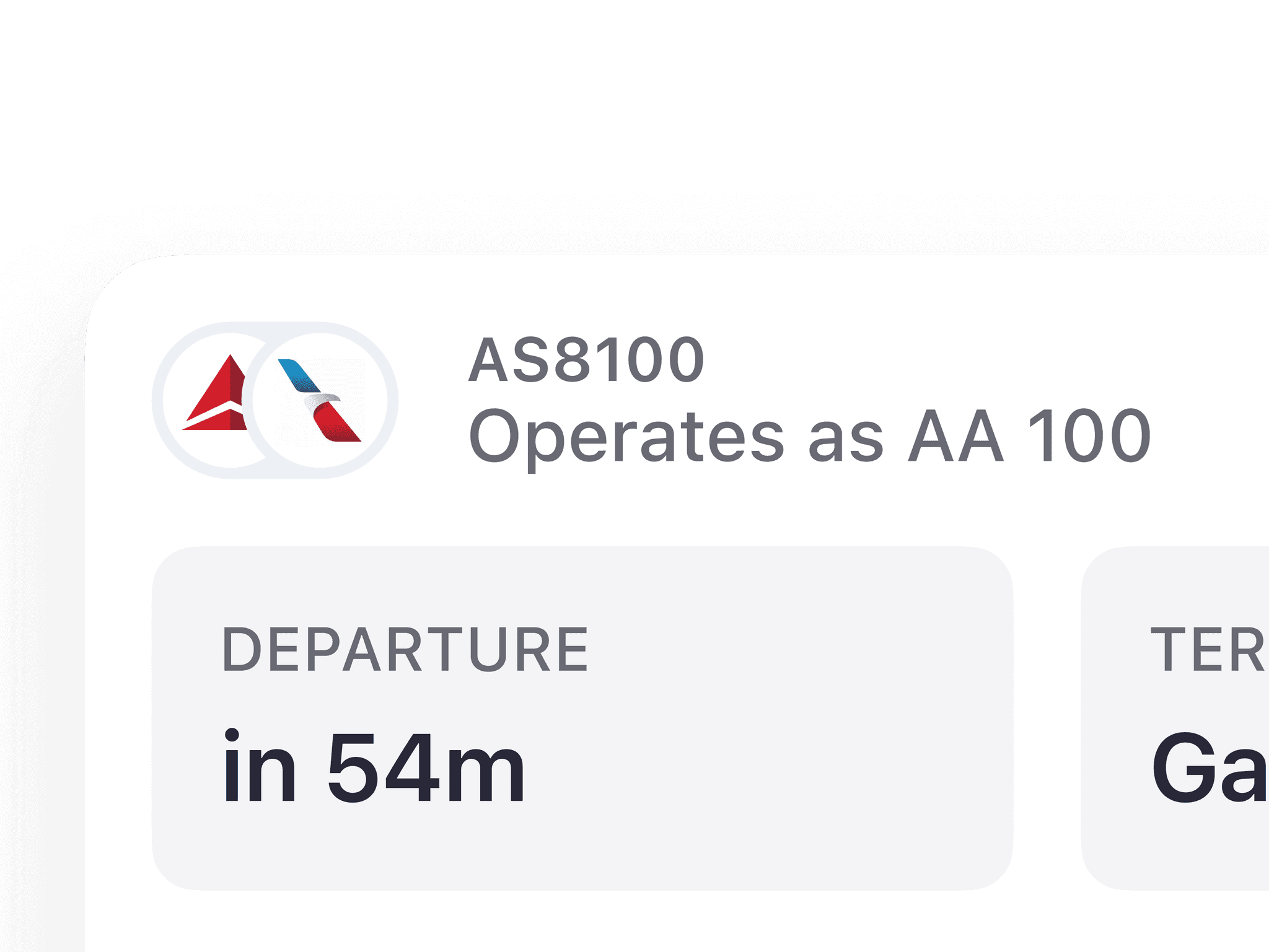
By the way, did you know that flight number on your boarding pass may differ from the flight number on the Departures table? These are codesharing flights, when the flight is sold by multiple companies, but operated (obviously) by one of them.
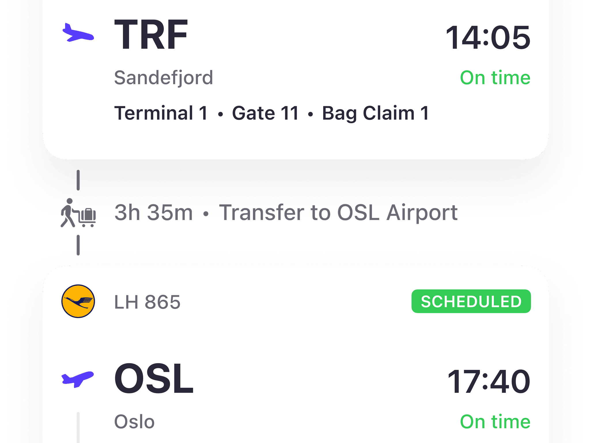
As a cherry on top, we now detect 'travel hack' flights, where you have a self‑transfer, or even an overnight layover, connecting the flights into a single trip.
App Navigation
Initially, all the pages opened as modal views above the main map view.
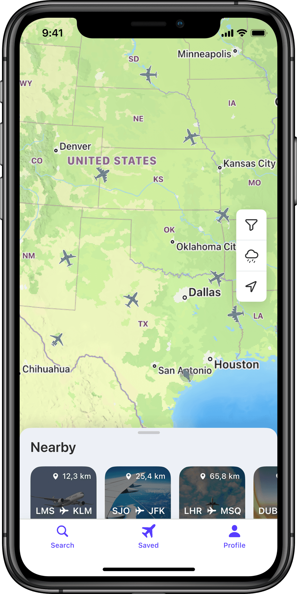

Travelers didn't need a map with all the flights above in the sky. What travelers needed is a quick and convenient way to get to saved flights.
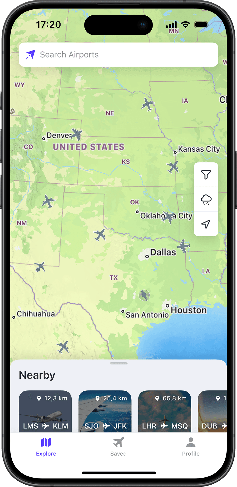
Flight Details Page
At this point, we were gradually rolling out these updates to smooth out the transition for existing users.
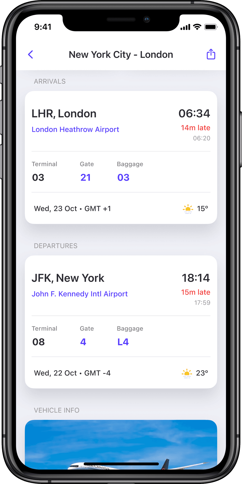
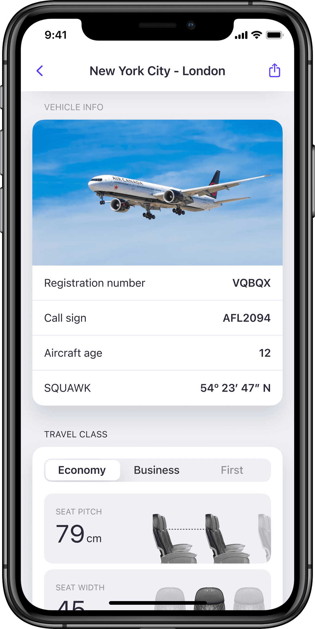
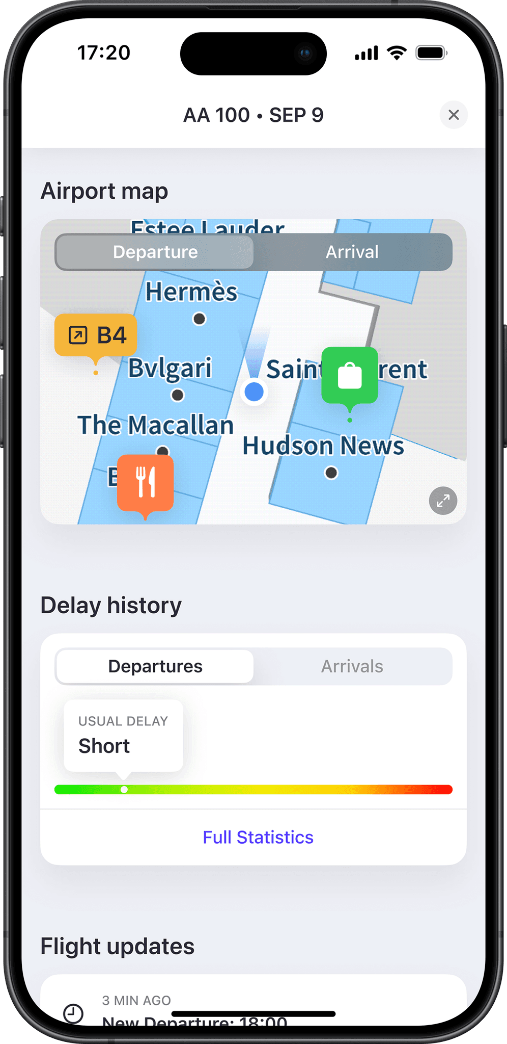
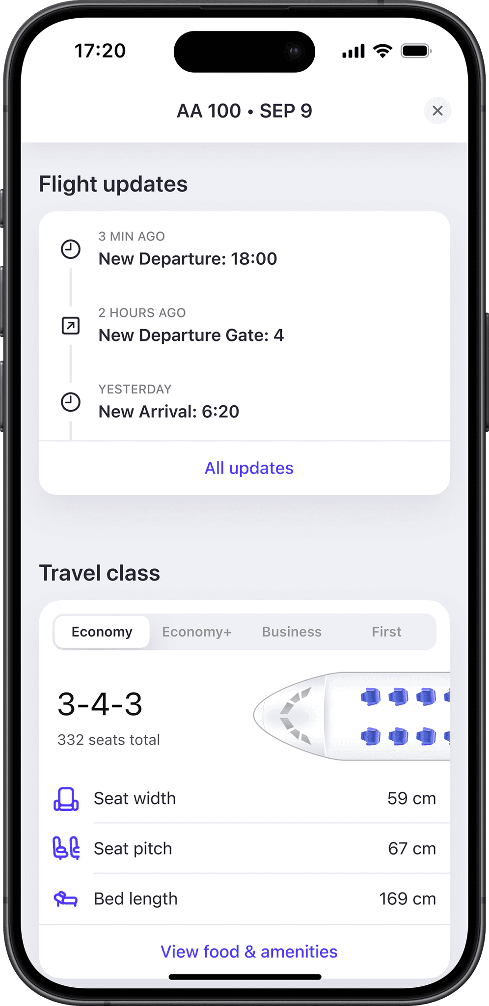
However, there was still an area not yet reworked — flight page, which you open by tapping the flight card to get more details.
At the time, this page was trying to serve both plane spotters and travelers, lacking something for both groups.
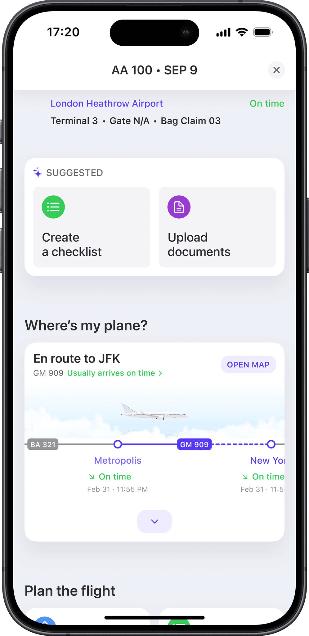
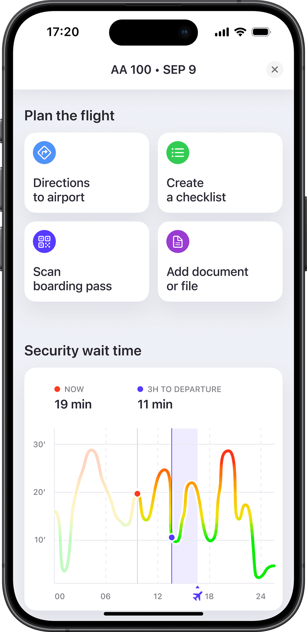
With the redesign I've tried to add value with each section.
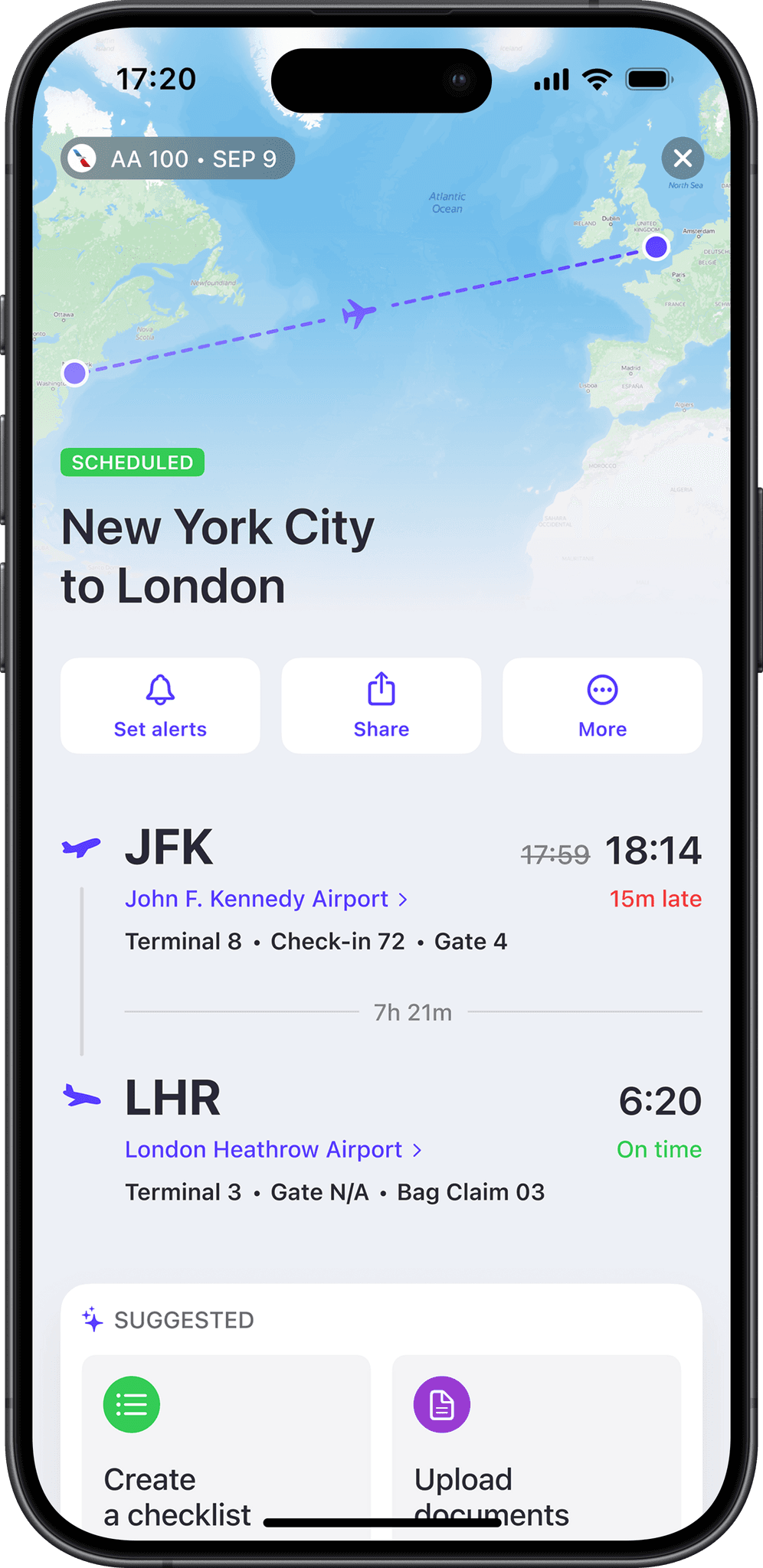
The part I like the most is the 'Suggested' widget.
It's placed right under the main flight info and aims to make you travel less stressful by providing shortcuts to features relevant to the current section of your flight.
Conclusion
As a result, we've evolved the app into travel assistant by updating the saved flight card, swapping the navigation pattern to the one more convenient on the go, and reworking the flight page.
These efforts led to 25% growth in user stickiness and 20% increase in conversion from app's start page to the defining 'A‑ha moment' action — finding your flight, while building the foundation for further improvements for a smoother travel experience.
Learnings
There's a lot that could be done when it comes to personalizing someone’s experience, especially if it’s as complex and hectic as travel. Some areas are still left uncovered: booking a taxi to an airport or checking long‑term car parking at the airport.
There's a whole different journey after the plane's landed, too.
