Role
Sr. Product Designer
Team
15 people
Timeline
Jul, 2022 – Feb, 2023
Introduction
Pixomatic is an image editing app mainly used to create social media graphics, collages, and postcards. While offering a wide array of tools, it wasn't quite optimized for newcomers, as confirmed by multiple first‑time user experience tests. Users felt overwhelmed by the number of tools available, and many of these tools required some level of experience to achieve pleasant results.
One of our high-level goals was to refine the beginner's experience.
We aimed to introduce beginner‑friendly tools, simplify existing complex ones, and educate newcomers on their use — all while dealing with constraints set by legacy code and architecture.
I was in charge of the UX, UI, and interaction design of the app.
Challenges
Background Randomizer
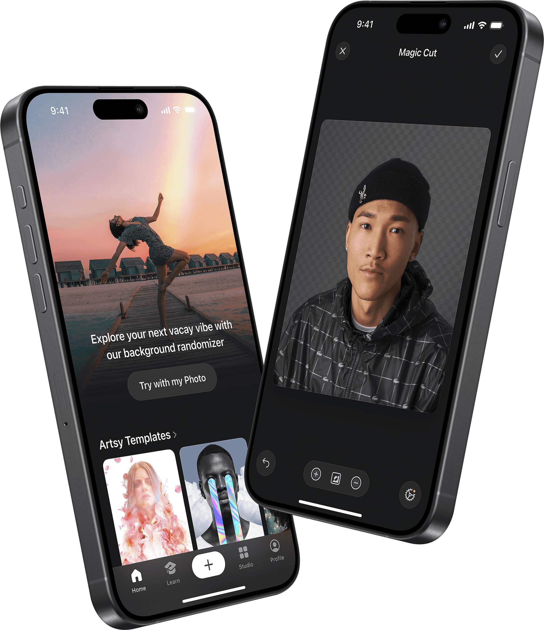
The idea of this feature came up during one of our brainstorms: you select a photo, the app automatically removes its background and shuffles through a set of alternative backgrounds, presenting you with a random one as a result.
The goal was to present the core strength of an app, background removal, in a fun, easy, and delightful way.
I’ve placed it on the home screen to fulfill several objectives: present newcomers with something to try right away, make the tool easily accessible for repeated use, and create a space to promote different background sets, which we would swap based on the season — Christmas, Vacations, Halloween, etc.
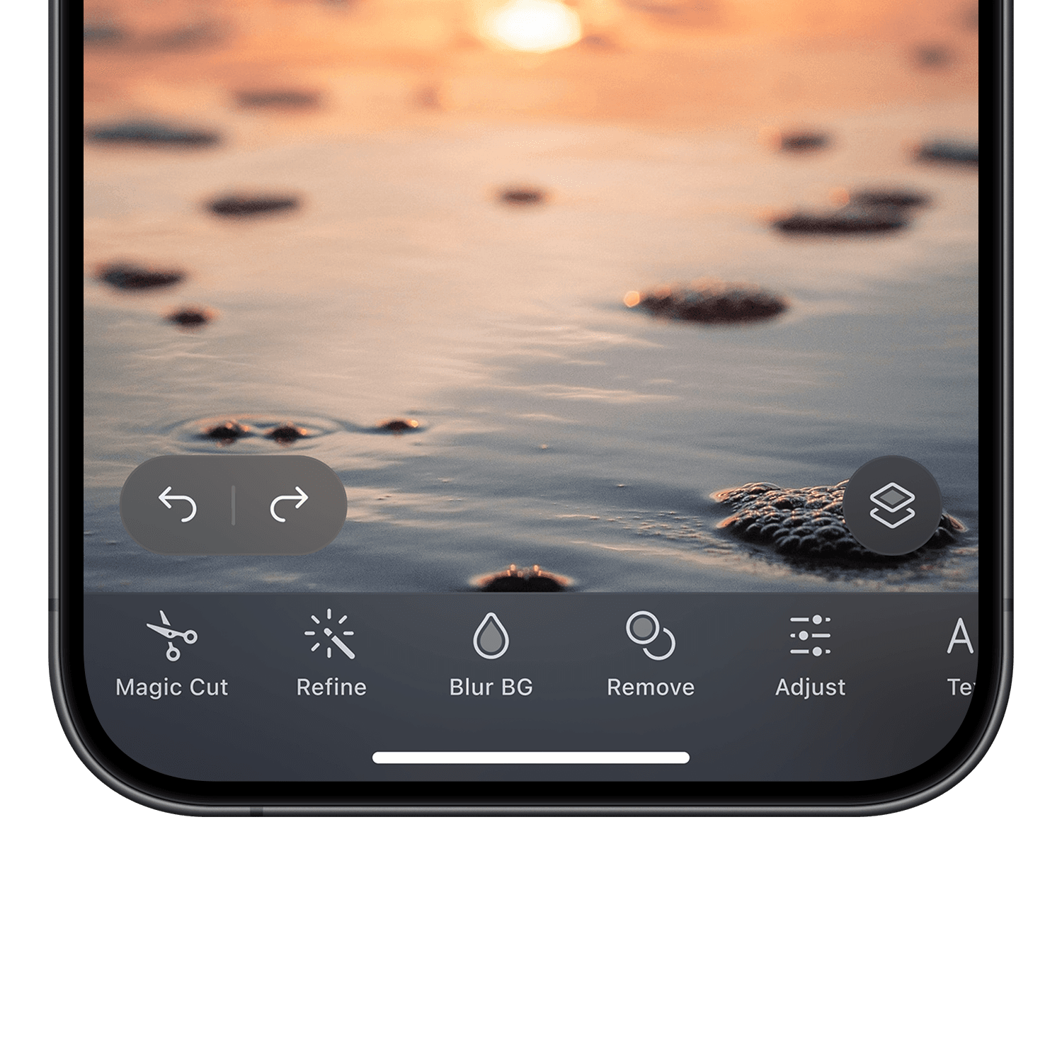
I’ve designed this feature as a standalone tool to avoid overloading new users with a complex full-on edit mode. However, if the result needed refinement, users could transfer it to edit mode with the layer structure intact.
All in all, background randomizer was a huge success for us, since 5% of subscription trials started from this tool.
It also got us an App Store feature in Asian countries.
Background Removal Modes
User interviews confirmed that Pixomatic is frequently used to create collages by separating an image into several layers and placing text between them to create depth.
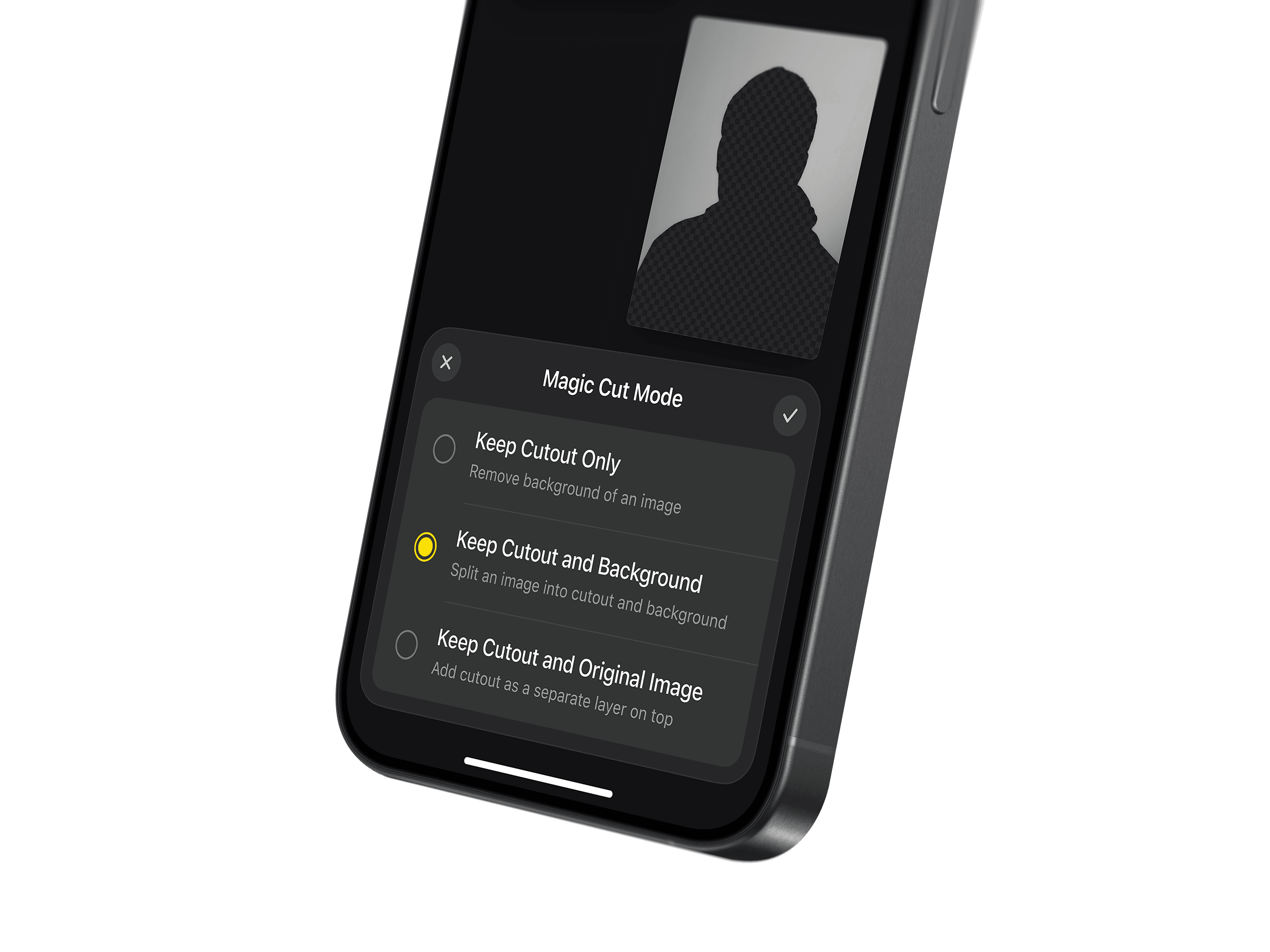
Back then, to achieve that, you'd need to remove background from an image, import that same image as a new layer, and place the new layer below the cutout. Sounds pretty complex, right?
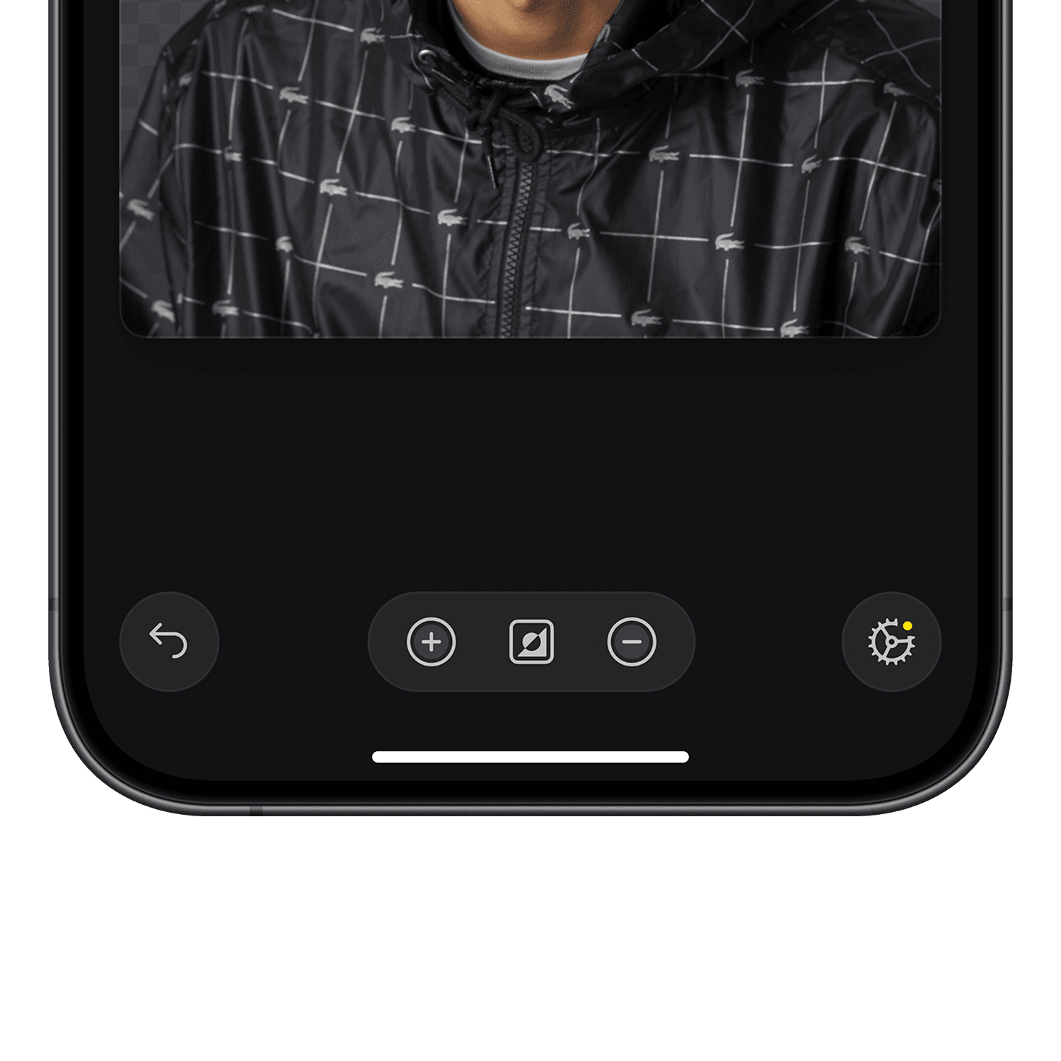
To tackle this, we've added two new options for background removal — separating foreground and background into 2 layers or keeping the original image, while placing separated foreground as a layer on top of it.
I've placed this setting inside the tool itself to avoid the frustration of having to close it and going somewhere else to change the setting.
Since background removal was already implemented, we had the needed technology. A quick development task resulted in a huge quality of life improvement, allowing users to streamline their editing process.
Templates
Small business owners and content creators were one of our primary user groups because of their better metrics and engagement. Surveys and user research confirmed that they needed to create a lot of similar social media content, fast.
In order to streamline these tasks, we've introduced templates — beginner‑friendly, pre‑made one‑click edits.
Users simply selected an image, and the app did the rest: removed the background and placed the image inside the template. The result could be fully customized later, providing users with a solid foundation.
Moreover, there were templates tailored to other user groups, like postcards and memes. The order of template sections on the home screen was adjusted based on users' goals specified in the onboarding survey.
Conclusion
These are just the highlights, though.
As a result of my work on Pixomatic, our North Star (number of images exported) doubled, iLTV increased by 2.5×, yearly revenue grew by 12×, and the app rating improved from 4.39 to 4.58.
Additionally, we did some quality‑of‑life improvements: created a unified color system for the app, transitioned to system fonts, unified navigation bars & introduced learning center with tutorials.
Please note, the UI and animations in this case study have been updated to reflect my current standards.
